


Christof Rühl and Tit Erker
Oil consumption, GDP growth, trend of oil intensity – these are not words which sound like the beginning of a good story. And yet, strange things happen sometimes, as you are about to see, and they may happen anywhere: even in energy economics.
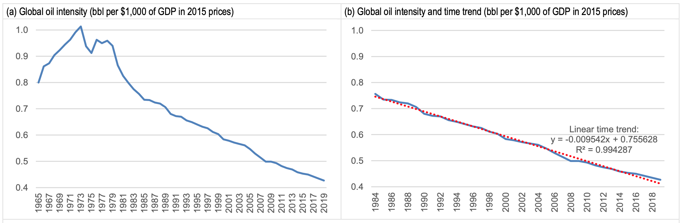
Oil intensity is defined as the volume of oil consumed per unit of GDP. Measured simply in barrels per Dollar, it is often viewed as a broad measure of oil efficiency; and for sure, it tells us about the importance of oil in a society.
A society becoming more or less oil intensive can mirror many influences: from our preferences (how important are big cars or plastic bottles?) to technical efficiency improvements (how much oil does it take to drive a car? or to produce a plastic bottle?) to changes in the structure of society, such as industrialisation or urbanisation. It is the day job of economists to link these factors to each other, to the price of oil and to society’s income, but that’s a different story.

It may not come as a big surprise that oil intensity has improved over the years and decades; that is, our ‘dependency’ (as many will call it) on oil has diminished, or we have become more efficient in dealing with the black, sticky stuff. Way back when – in 1973 to be precise, when oil intensity was at its zenith – the world took a little more than one barrel of oil (a barrel is 159 litre or 42 US gallon) to produce $1000 worth of GDP (2015 prices). Hold it and step back – more than 159 litres or 42 gallons per $1000 worth of GDP? It is quite incredible to think about it in these terms. Now you know why oil is such a big deal for the global economy.
By 2019 BC (last data Before Covid) global oil intensity had declined by 58%, to 68 litres or 18 Gallon per $1000 of global GDP. Not bad at all, although – if one starts thinking about it again – still a lot of oil for every move we make on this planet. Oil has become a lot less important and we have become more efficient in making use of it: no big surprise here.
The big surprise starts if one looks at the pattern in which this progress has been achieved. Since 1984, for 35 years, oil intensity has improved in an almost perfectly linear fashion. This is as regular as one can imagine: every year, the amount of oil used per Dollar of global GDP has fallen by roughly the same amount.
Primary fuel shares and global oil demand
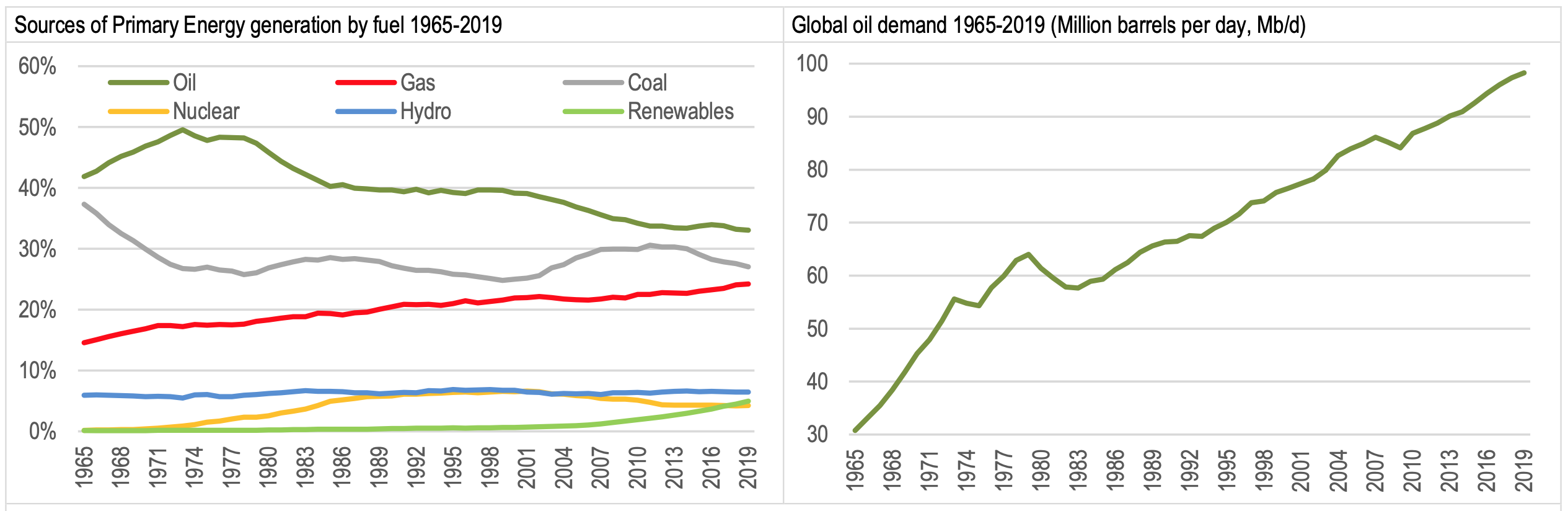
Data Source: BP (2020)
35 years is a long time. It is time enough to have seen wars and revolutions, booms and busts, OPEC successes and failures, the rise of China and the collapse of the Soviet Union – all leaving an imprint on oil markets. And through all this time the stable, regular and consistent trend in oil intensity has soldiered on. The graph below shows how the annual data (left) transform into an almost perfectly straight timeline for the years 1984-2019, with an impressive statistical fit. It bears repeating just how remarkable this regularity is for any long term trend – in economics or in energy. Just think of the predictive power knowledge of this trend would have bestowed!
I have used this trend for years, in a fast and loose way, to illustrate thought experiments. Here is a trend, the pitch goes, which has been around for so many decades, let’s just assume it will be around for a little while longer… to see what would happen to, say, oil consumption after Covid, or to peak oil demand, or to whatever other topic could be addressed by the easy logic of extrapolation.
Until, that is, a more sophisticated and smarter member of the energy economists’ tribe tapped me on the shoulder (figuratively speaking), with a gentle but firm ‘not so fast’. He clearly didn’t believe in the didactic magic of trends which were left unexplained (and could not continue forever). In fact, he probably didn’t believe in the existence of this particular oil intensity trend at all.
Global oil intensity and time trend since 1984
And so my co-author Tit Erker and I went digging. And we found the trend, however often we looked, again. What we didn’t find was an explanation. In fact, we didn’t find a discussion. We barely found a mention of it.
This is not supposed to happen.
Oil consumption is an important category in energy. GDP is perhaps the most important aggregate in economics. Their ratio (the inverse of oil productivity) is an indispensable concept, to put it mildly. It reflects a linear time trend and after 35 years no one has noticed? Or thought it strange enough to discuss? Everything, the saying goes, is in a book somewhere. What about this one? We did what we had set out to do and verified the trend one more time, and then wrote up our own conclusions on what may explain it. They are here.
Like the rest of us, I harbour a degree of suspicion when laying eyes on something which ought not to be there. A little like meeting a ghost at midnight. The trend I have described falls into this category. And so, despite a ‘homework done’ feeling (of course we believe we have finally found the right explanation!), I am waiting for someone to step up to tell me that this was a serious lapse of judgement; a chimera; and that, really, there is nothing special and especially nothing linear about the way oil intensity is declining. Or points me to a collection of articles with a sophisticated, competent and most confident explanation of why this trend just has to be there, in exactly the way it is.
Until then, it is just there. It has veered off track a little the last few years because of shale oil in the US. But the post-corona data look set to bring it right back on… What an apt correction.